How to Create a 3D Dashboard: The Ultimate Guide


Heading 2
Heading 1
Heading 3
Heading 4
Heading 5
Heading 6
Lorem ipsum dolor sit amet, consectetur adipiscing elit, sed do eiusmod tempor incididunt ut labore et dolore magna aliqua. Ut enim ad minim veniam, quis nostrud exercitation ullamco laboris nisi ut aliquip ex ea commodo consequat. Duis aute irure dolor in reprehenderit in voluptate velit esse cillum dolore eu fugiat nulla pariatur.
Block quote
Ordered list
- Item 1
- Item 2
- Item 3
Unordered list
- zz
- Item B
- Item C
Bold text
Emphasis
Superscript
Subscript
Your clients' progress is a story of hard work, dedication, and transformation. But numbers alone—pounds lost, inches gone—are just plot points. They lack the narrative power to keep someone truly engaged. A 3d dashboard is your tool for telling that story visually. It translates abstract data into a compelling, three-dimensional chronicle of change, showing clients the direct impact of their efforts on a realistic model of their own body. Instead of just reading a report, they can see their journey unfold. This powerful visual feedback reinforces their commitment and turns data into a source of motivation, keeping them invested in the next chapter.
Key Takeaways
- Show, Don't Just Tell, Progress: Use 3D visualization to transform abstract numbers into a tangible, photorealistic model of a client's body. This visual proof of change is far more compelling than a scale and helps keep clients motivated and engaged in their wellness journey.
- Tailor the Dashboard to the Role: Create specific views for different users, such as trainers, clients, and managers. By using customizable tabs and widgets, you can ensure everyone sees only the most relevant data, making the tool more efficient and focused for each person's needs.
- Prioritize Clarity Over Clutter: A successful dashboard tells a clear story. Avoid overwhelming users by being selective with the data you display and organizing it logically. A clean, consistent design makes information easier to digest and turns your dashboard into a functional tool, not a confusing data dump.
What is a 3D Dashboard?
A dashboard is your command center. It’s a single screen that organizes all the important information and tools you need to do your job effectively. Think of it as a personalized workspace where you can see client data, track progress, and manage your services all in one place.
A 3D dashboard takes this concept a step further. Instead of just showing you flat charts and numbers, it uses three-dimensional visuals to bring your data to life. For businesses in the wellness space, this is a powerful way to represent client progress. Imagine showing a client at your weight management center not just that they lost five pounds, but showing them exactly where those changes occurred on a realistic 3D model of their body.
These dashboards are typically built with customizable components. You might have different "tabs" for different clients or services, and each tab can hold "widgets" or apps that display specific information. For example, one widget could be a client’s latest 3D body scan, another could track measurement changes over time, and a third could show a heat map of muscle gain. This setup allows you to tailor the view to what matters most, giving you and your clients a clear, comprehensive picture of their journey.
How 3D Dashboards Differ from 2D
Traditional 2D dashboards present data in flat formats like graphs, charts, and tables. They are useful for showing numbers and basic trends, but they can feel static and often fail to capture the full story.
A 3D dashboard, on the other hand, offers a more interactive and immersive experience. The main difference is its ability to visualize data in a three-dimensional space. Instead of just reading that a client lost two inches from their waist, you can see that change on a 3D avatar that you can rotate and inspect from any angle. This approach makes complex relationships, like simultaneous fat loss and muscle gain, instantly clear in a way that a spreadsheet never could. It transforms abstract numbers into a tangible, visual narrative of progress.
The Building Blocks of a 3D Dashboard
A great 3D dashboard is more than just a collection of flashy graphics; it’s a carefully constructed workspace designed to give you clear insights at a glance. Think of it as the command center for your wellness business. Its real power comes from its underlying structure, which organizes complex data into a simple, interactive format. Understanding these foundational elements is the first step toward creating a dashboard that works for you, your team, and your clients.
The architecture of any effective dashboard rests on three pillars. First are the core components—the tabs, widgets, and tools that create an organized and intuitive layout. Second is the method of visualization, which transforms raw numbers into insightful 3D models and charts that tell a compelling story. Finally, there's the user experience, which is all about customizing the dashboard to show the right information to the right person at the right time. By getting these building blocks right, you can turn your client data into your most valuable asset for driving results and retention.
Core Components: Tabs, Widgets, and Tools
The best dashboards are neatly organized, and this structure is built from a few key components. Most are designed with tabs, which function like different pages or workspaces. Each tab holds a collection of widgets or apps, which are individual windows that display a specific piece of information or provide a certain tool. The widgets you see often depend on your role, ensuring that a personal trainer sees client progress while an owner sees business-wide analytics. This modular system keeps everything tidy and prevents information overload. For example, you could have one tab for client management and another for marketing, each populated with relevant widgets.
How 3D Dashboards Visualize Data
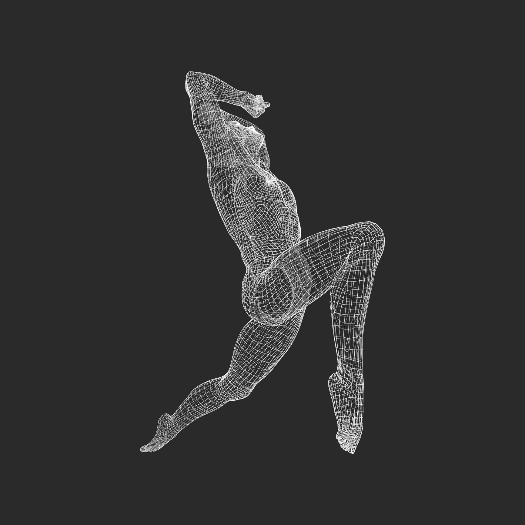
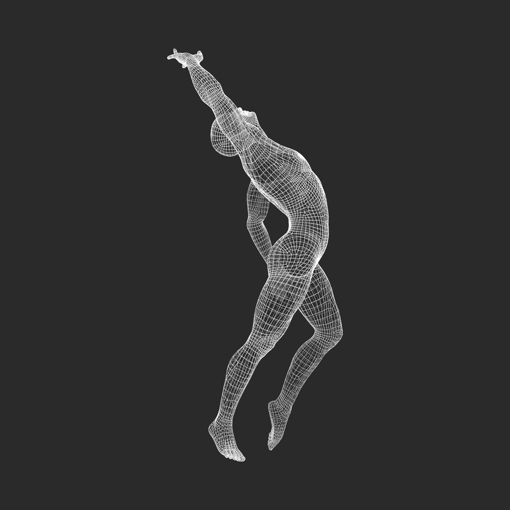
This is where 3D dashboards truly shine. Instead of relying on flat, two-dimensional charts, they use three-dimensional space to represent data in a more intuitive and impactful way. For a wellness business, this often means transforming client body scan data into a photorealistic 3D avatar. This model can be rotated and examined from any angle, providing a complete view of a client’s physique. More importantly, these dashboards can use color-coded heatmaps overlaid on the model to show precise areas of change, like fat loss in green and muscle gain in blue. This visual proof of progress is far more powerful than numbers on a scale, helping clients see and understand their results.
Customizing the User Experience
A dashboard is only useful if it shows you what you need to see. That’s why customization is so important. A one-size-fits-all approach rarely works, as a medical spa manager needs different data than a client tracking their body contouring results. Effective dashboard design is intentional, allowing you to choose which widgets to display and how to arrange them. This ensures the most critical information is always front and center. For your clients, this means they can personalize their view to focus on the metrics that align with their goals, creating a more engaging and motivating experience that keeps them coming back.
How to Create Your 3D Dashboard
Creating a 3D dashboard might sound like a job for a tech wizard, but it’s actually a straightforward process when you break it down. Think of it as setting up a personalized command center for your business and client data. The goal is to transform raw numbers—like body composition changes from a 3D body scan, fitness milestones, or member check-ins—into a clear, visual story. For wellness professionals, this is incredibly powerful. Instead of just telling a client they’re making progress, you can show them. Visualizing their journey helps keep clients motivated, validates their hard work, and reinforces the value of your services, which is key for retention. By following a few simple steps, you can create a dynamic tool that helps both you and your clients see and understand their progress in a compelling new way.
Choose the Right Software
Your first step is selecting a platform that fits your needs. You don’t need to be a data scientist to build a great dashboard. Many modern software options are designed for ease of use, often featuring intuitive drag-and-drop designers that let you build visuals without writing a single line of code. When evaluating software, look for a tool that can handle the specific data your wellness business generates. The right platform will make it simple to create clean, web-based visualizations that you can share with clients or use internally to track business performance. The goal is to find a solution that feels less like a chore and more like a creative tool for telling a data-driven story.
Build Your Dashboard, Step by Step
Once you have your software, it’s time to build. Most platforms make this process simple. After logging in, you’ll likely see a default dashboard. To create a new one, look for a menu, often near the top-left corner of the screen. From there, you should see an option to add a new dashboard, usually represented by a plus sign. This action opens a blank canvas for you to customize. Give it a clear, descriptive name like “Sarah’s Fitness Journey” or “Q4 Member Engagement” to keep things organized from the start. This initial setup is the foundation of your data visualization. For a more detailed walkthrough, you can often find helpful step-by-step guides online that break down the process visually for specific platforms.

Add Interactive Features and Live Data
A blank dashboard is just a starting point. The real value comes from adding interactive elements that display live data. These elements are often called "widgets" or "apps," and you can place them on your dashboard to show specific information, like a client’s body fat percentage change over time or a gym’s member attendance rates. You can arrange these widgets however you like, creating a layout that makes sense for you. The specific widgets and apps available may depend on your user role, which allows you to control who sees what data—perfect for managing information across trainers, front-desk staff, and management.
Solve Common Setup Challenges
As you build your dashboard, two common challenges can arise: information overload and inconsistent design. To avoid overwhelming your viewers, be very intentional about which data points you include. A great dashboard tells a clear story, so focus only on the metrics that matter most to your business and client goals. Second, maintain a consistent visual style. Using a clear and uniform approach to colors, fonts, and icons makes the dashboard more professional and easier to read. Following these simple dashboard design best practices ensures your final product is both beautiful and functional, helping you communicate information effectively.
Get the Most from Your 3D Dashboard
A 3D dashboard is more than just a collection of charts and numbers; it’s a tool for understanding your business and your clients on a deeper level. Once you have your dashboard set up, the next step is to use it effectively. A well-designed dashboard can transform how you track progress, communicate with your team, and engage with clients. It turns raw data into actionable insights that can guide your business strategy, from refining client programs at your weight management center to optimizing service offerings. By focusing on clarity, engagement, and user experience, you can ensure your dashboard becomes an indispensable part of your daily operations.
Make Better Decisions with Clearer Data
A great dashboard cuts through the noise. To make smart decisions, you need data that is easy to understand at a glance. This starts with being selective about what you display. Prioritize the most relevant metrics that directly support your goals, whether that's tracking a client's body composition changes or monitoring membership trends. Consistency is also key for clarity. Using the same colors, fonts, and icons for similar data points helps you and your team process information quickly without getting bogged down. A clear visual language makes it easier to spot trends and make informed choices that drive real results for your clients and your business. This focus on intentional data presentation is what separates a useful dashboard from a confusing one.
Improve Team and Client Engagement
Your dashboard can be a central hub for collaboration. For teams, it provides a shared view of client progress, allowing personal trainers, nutritionists, and other wellness professionals to work together more effectively. When everyone is looking at the same data, communication becomes clearer and more focused. For clients, a visual dashboard is incredibly motivating. Seeing their 3D body scan evolve over time makes their progress tangible and exciting. This visual feedback loop strengthens their commitment and trust in your services. Engaging dashboards create a more interactive and supportive experience, turning a simple check-in into a meaningful conversation about goals and achievements. This is especially effective for personal trainers looking to build strong, lasting client relationships.
Tips for a Fast and User-Friendly Dashboard
A dashboard is only useful if people actually use it. To encourage adoption, it needs to be fast, intuitive, and accessible. The goal is to present complex data without overwhelming the user. One of the core dashboard design principles is minimizing cognitive load, which means keeping the layout clean and simple. Avoid cluttering the screen with too much information. Use interactive elements thoughtfully, allowing users to drill down into details when they need to, rather than showing everything at once. A responsive design that works seamlessly on desktops, tablets, and phones is also critical for modern wellness businesses. If you want to see these principles in action, you can book a demo to see how a professionally designed dashboard can work for you.
Advanced Tips and What's Next
Once you've mastered the fundamentals of creating your 3D dashboard, you can begin exploring more advanced features to refine the user experience. These next steps are about moving from a functional dashboard to one that is truly intuitive, efficient, and tailored to the specific needs of your wellness business and your clients. By focusing on smart customization, organization, and future-ready design, you can create a powerful tool that clearly communicates progress and drives client motivation.
Use Pre-built Widgets and Custom Settings
Most dashboard platforms offer pre-built templates and widgets to help you get started quickly. Instead of building from a blank slate, you can select a template designed for a specific purpose, like client progress tracking or business analytics. From there, you can drag and drop widgets—small, dedicated applications—onto your dashboard to add specific functionalities. For instance, a dashboard for personal training could use a widget that isolates and compares 3D body scan data from two different dates. A med spa might use one to show changes in body circumference measurements post-treatment. This approach saves time while still allowing for deep customization to fit your unique services.
Keep Your Dashboard Organized and Up-to-Date
A cluttered dashboard is an ineffective one. To ensure your data is easy to read and act upon, organize your layout around your typical workflow. Create separate tabs for different tasks or client groups, and give them clear, descriptive names. For example, a health club might have tabs for "New Member Onboarding," "Weight Loss Challenges," and "Performance Athletes." Arrange your widgets logically within each tab, placing the most important information at the top. This thoughtful organization minimizes the time spent searching for data and allows you and your clients to see key insights at a glance, making every interaction with the data more efficient and impactful.
The Future of 3D Data Visualization
The world of data visualization is constantly evolving, with a growing focus on creating more interactive and user-friendly experiences. Future dashboards will lean heavily on core design principles like clear visual hierarchy, consistency, and accessibility to make complex 3D data understandable for everyone. For wellness professionals, this means even more powerful tools to illustrate client transformations. Imagine dashboards that not only show data but guide the client through their results with interactive highlights and simplified summaries. Staying aware of these trends will help you adapt your dashboards to continue offering a premium, high-tech experience that sets your business apart.
Frequently Asked Questions
How does a 3D dashboard actually help my clients see their progress better than a simple chart? A chart can show that a client lost five pounds, but a 3D dashboard shows them how that change reshaped their body. By displaying progress on a realistic 3D model, clients can see specific areas of fat loss or muscle gain. This transforms abstract numbers into a tangible, visual story that is far more motivating and easier to understand, reinforcing the value of their hard work and your guidance.
Do I need technical skills or coding knowledge to create a 3D dashboard? Not at all. Modern dashboard software is designed for business owners, not developers. Most platforms use intuitive drag-and-drop interfaces that allow you to build and customize your dashboard without writing a single line of code. The process is more about choosing the right visuals and data points than it is about complex technical work.
Beyond looking impressive, how can a 3D dashboard benefit my wellness business? The primary business benefit is client retention. When clients can clearly see their physical transformation on a 3D model, it validates their investment in your services and keeps them motivated to continue. This visual proof of results builds trust and strengthens the client relationship, leading to longer-term commitments and better word-of-mouth referrals.
Can I control what information my clients see versus what my trainers can access? Yes, absolutely. Effective dashboard platforms are built with different user roles in mind. You can create a customized view for your clients that focuses on their personal progress and goals. At the same time, you can provide your staff with a more detailed view that includes multiple client metrics or business analytics, ensuring everyone sees only the information relevant to them.
Is setting up a 3D dashboard a long process, or are there tools to make it faster? You don't have to start from a blank canvas. Many platforms offer pre-built templates and widgets designed specifically for wellness businesses. You can select a template for client tracking, for example, and then add specific widgets for body scan comparisons or measurement changes. This approach significantly speeds up the setup process, allowing you to create a professional and functional dashboard quickly.